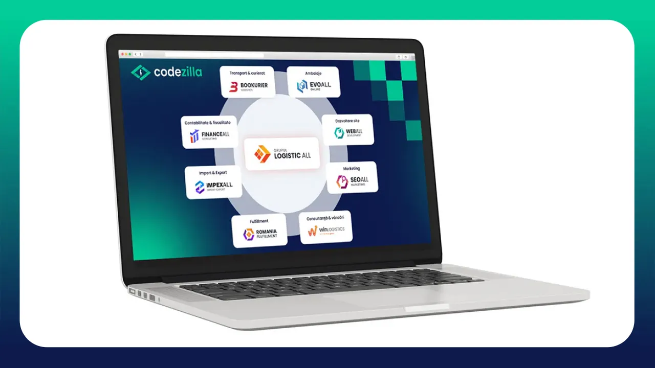
The ALL Logistics Group, a group of companies offering integrated business solutions, from logistics solutions to marketing and financial services, has chosen Codezilla to create a new visual identity for the companies within the group. The project comes in the context of several companies joining the group and involves rebranding for existing brands and a visual identity for the new ones.

Brief
Creating a set of modern, attractive, and memorable logos that symbolize the specific nature of each individual brand while maintaining a unified and representative visual identity for the group.
Challenge
Identifying common representative elements and consolidating the complex experience of the group when it comes to business consulting services.
Approach
The design proposals for the central logo (ALL Logistics Group), as well as for the other 8 brands within the group (Winlogistics, Impex ALL, Romania Fulfillment, Evo ALL, Bookurier, Web ALL, SEO ALL, and Finance ALL) were designed to reflect the identity and values of each company, combining appropriate graphic elements and color palettes.
Research
Each brand was analyzed in terms of its brand attributes, benefits offered, and unique selling proposition (USP), ensuring that the proposals were tailored to fit the individual personality of each brand within the group.
Graphic Line and Color Palette
For all logos, a minimalist graphic line was used, with geometric elements inspired by the services offered, using a specific color palette.
For the ALL Logistics Group, the idea of adaptability was highlighted, using an element formed from 4 different squares, as a symbol for the complexity of managing a business, brought together by an arrow, symbolizing the integrated support offered by the group's companies. This logo used a professional and modern color palette, consisting of several shades of orange.
For Impex ALL, stylized arrows were used in the logo to symbolize rapid transport and personalized analysis of customer needs, with a color palette in shades of blue, reflecting reliability and professionalism.
Romania Fulfillment is an adaptation of the central logo, using the same symbolism of the complexity of a business, in a puzzle that signifies the pieces that complete the whole - integrated fulfillment services. The colors used are purple and orange, offering a mix of modernity, digitalization, and professionalism.
The Evo All Online logo is constructed from symbols associated with logistics services (box, packaging) and has a color palette based on blue, expressing professionalism and innovation.
For Bookurier Logistics, we used the initial "B" as the central element and symbols associated with the speed and efficiency of deliveries, with a vibrant color palette, reflecting innovation and commitment to quality services.
The logos for Web All and Seo All, services associated with digital marketing, were made in a unified direction, represented by a hexagon symbolizing the digital footprint of the brand and an arrow (symbol of success), respectively a magnifying glass (symbol of search). The colors used are purple, suggestive of digital progress and marketing success, and turquoise, expressing professionalism and innovation - both adapted in vibrant, modern shades, symbolizing alignment with the latest trends.
For Finance All, we developed a concept based on the use of the initial "E", stylized in the form of an upward graph and a color palette of green and blue, conveying prosperity and confidence in the financial field.
Win Logistics Solutions has a logo built on the basis of the initial "W", transformed into an arrow pointing towards success, in a color palette that suggests sustainable growth and a passion for achieving goals.
The Group Universe
To support the positioning of all brands within the group as specialists in all business areas, offering integrated business consulting, we have created the brand universe of the ALL Logistics Group. This involves listing all logos around a nucleus - the group logo, an element that will be used for unity and recognizability both on the group's websites and in other communications and materials.
Result
The result of the rebranding was a group of modern, memorable logos that formed the cornerstone of the development of a complex and attention-grabbing digital universe - the websites of each brand (read more about the development process of the group's websites and the optimal approach we chose in this article).
Similar Articles
Want to chat more about this topic or any other topic?
Book a meeting with one of our digital monsters!