The client is one of the largest vegetable oil producers in Romania, with a history of over 100 years and plans for international expansion. They sought a redesign of their corporate website to build a modern, user-friendly digital presence.
Brief
The main objectives were:
- Creating a modern digital presence aligned with international standards.
- Positioning the client as a trusted international partner, not just a local producer and exporter.
- Developing a corporate presentation website that is professional yet accessible.
- Building a clear, professional UX structure aligned with the client’s brand identity.
- Delivering a bilingual experience (Romanian and English).
- Implementing a flexible CMS and SEO optimization.
Challenge
The vegetable oil industry is dominated by outdated and impersonal websites, making brand differentiation difficult. Our challenge was to create a website that successfully combines:
- The credibility of an industry leader.
- The clarity of a corporate platform that remains accessible.
- The approachability of a trusted brand with international visibility.
Approach
We built the website with a strong focus on delivering a digital experience that reflects the company’s market position and its future direction of international growth.
The strategy was defined around multiple user profiles, from international buyers and retail partners to institutional clients, ensuring the platform supports and reinforces the brand’s global ambitions.
Process
- Analysis & strategy: we started from the needs of different user segments, focusing on clarity, credibility, and international appeal; industry certifications and leadership elements were integrated to reinforce trust and authority.
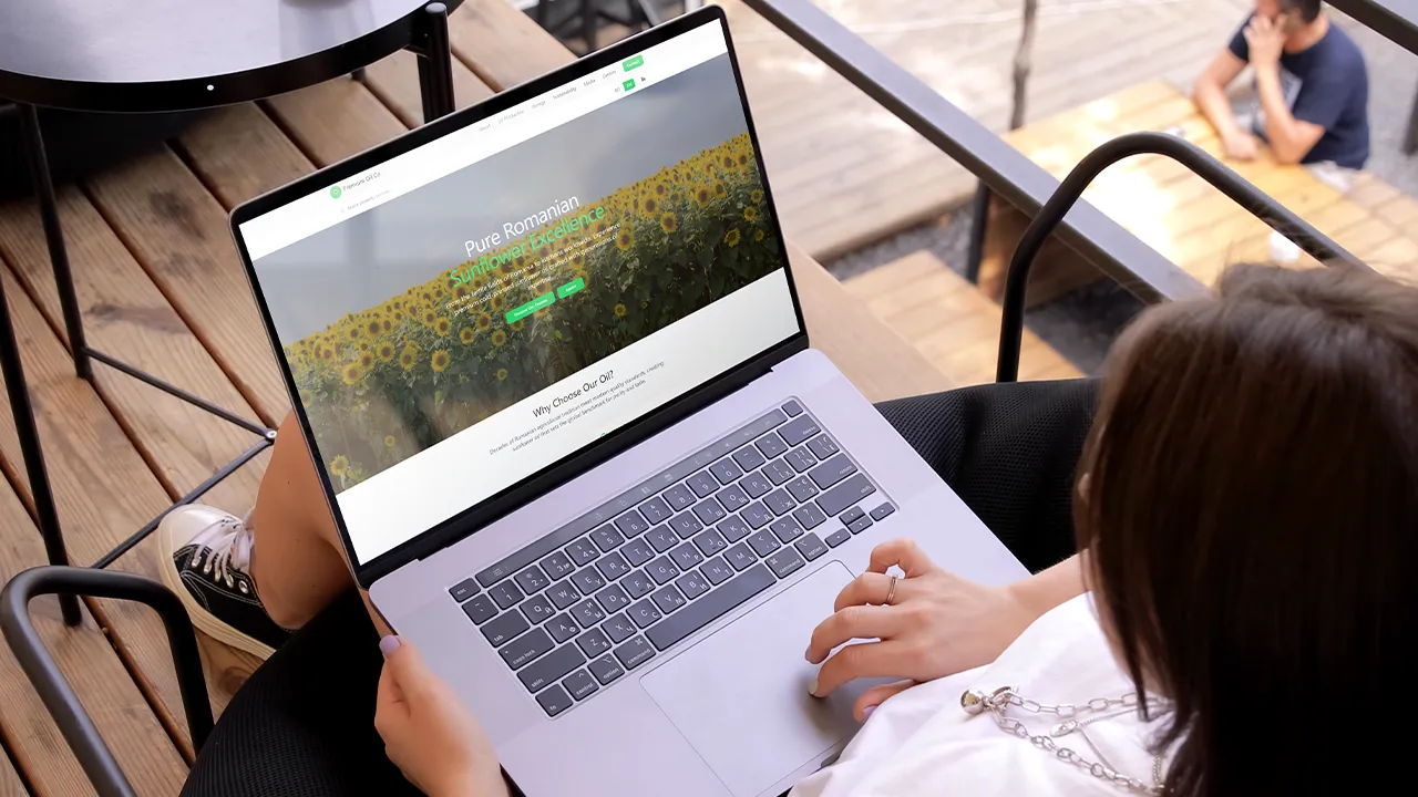
- UX & UI Design: we designed a clean interface aligned with the brand identity, using modern imagery and visuals; clear CTAs, a contemporary color palette, and legible typography were applied to ensure brand consistency.
- UX Architecture: we restructured the information architecture to simplify access to products, certifications, and key information; mobile navigation was optimized, dedicated sections for international event participation were created, and strong emphasis was placed on implementing the “why choose this brand” logic across conversion-focused pages.
Technologies Used & Solutions
- Frontend: high performance, SEO-friendly implementation with fast, dynamic, and fully responsive interfaces.
- Backend: custom CMS developed to ensure maximum content flexibility.
- SEO: clean URLs, semantic HTML, and optimized tags and metadata.
- QA, DevOps, SEO & GO LIVE: fully managed end-to-end by the Codezilla team.
Identity & Branding
The visual concept leveraged the brand’s identity and translated it into a clear, modern digital experience designed to reinforce its leadership position and attract global partners.
Results
- Modern, clean website aligned with current digital standards.
- Strengthened international brand positioning and increased attractiveness for global partners.
- Modular, SEO-friendly CMS ready for digital campaigns.
- Dedicated pages for certifications, events, and products.
- Intuitive navigation and updated visuals optimized for all screen sizes.
Similar Articles
Want to chat more about this topic or any other topic?
Book a meeting with one of our digital monsters!